Earlier this year I released the WeatherStar 4000+, a retro-looking weather forecast and current weather conditions app based on the look and feel of the 90’s Weather Channel.
We’re all used to weather information that’s very easy to access and is at our fingertips. My phone right now, in it’s “off” state, has a little blurb on screen with a few weather details. In the 30+ years since the WeatherStar debuted on cable both the accessibility and the amount of data available for a forecast is much more expansive.
For this project and for me the challenge and question has been can I integrate new forecast information and not disrupt the nostalgia of the system? After a lot of though earlier this year, I took a cue from the “Travel Forecast” scrolling screen and turned it into an hourly forecast in the same style. It fit within the aesthetic and worked very well to show off new hour-by-hour forecast data that is now available.
But I personally never liked the long scrolling screen. It just took too long to get all the way through it. So inspired by first several weather apps that provide a graph for the hourly forecast, and then another of my projects Tempreature.Express, I developed some new graphics for the WeatherStar4000+ for this exact purpose.
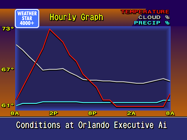
It’s new, and it’s not part of the original system. But I feel that it very well captures the low-resolution 90’s design of the original. A lot of considerations around how much data to display and how to arrange it were made. I borrowed as much as possible from already existing graphics such as:
- The x-axis times borrow sizing color and location concept from the Current Conditions and Travel Forecast screens.
- The legend in the top right is borrowed from the Radar screen.
- The line graphics are inspired by the Marine Forecast display that isn’t present in this WeatherStar4000+ but is in other adaptations as well as the original.
- The blue background surrounded by orange is used on many of the text based displays although slightly modified at the bottom for the x-axis labels.
- The rest of the header and footer is common to almost all of the other displays in the original WeatherStar 4000.
Also part of my considerations were should I intentionally pixelate the graph? I decided against this. In a previous update to the WeatherStar 4000+ I changed from drawing on a canvas, which resulted in a pixelated look when used full-screen, to HTML and appropriate fonts. This means that everything appears clean and crisp when running full screen. The weather icons (such as “Sunny”) are still the same size and do appear slightly pixelated full-screen, but that’s part of the charm and nostalgia. I did go through the exercise of pixelating this new display by drawing it at half-resolution and then scaling up but it just looked bad against the background and text that all scales fairly cleanly. I backed out that change.
Please join the discussion at GitHub if you have questions or comments on the new screen.