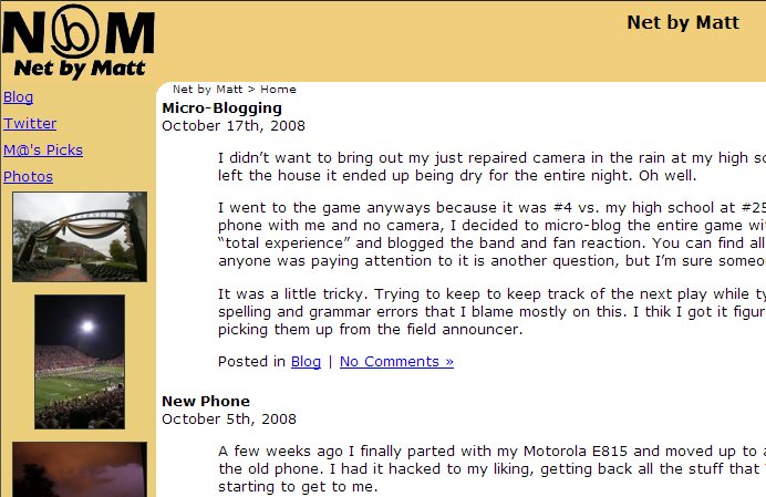
It’s done. Just over a weekend of work and I have re-designed both the blog and photos section of the site. Here’s what it used to look like.

That was from the summer of 2002, when I started at Purdue. Then, the site ran on Greymatter and didn’t have a photos section. Now, I’ve upgraded to WordPress and I’m using Gallery 2 to handle the photos.
About all that made it through the re-design was the backwards “b” logo (short for “by” and styled after the @ symbol) and the content. The tweets and random photos in the old design were added last-minute and didn’t fit the available space very well, which is what prompted me to start redesign the site.
I started with a WordPress theme called Grey Matter (purely coincidence) and customized it to my liking. I then adapted it for use with Gallery 2.
WordPress was a breeze to customize the theme, Gallery 2 was a little trickier. I feel like all of the documentation for it is not entirely up to date. For a challenge, I threw in some integration between Twitter, Gallery 2 and WordPress. You can see the results of that in the sidebar at the right with the random photos and recent tweets available on each page.
Something to note with the design, having the links and sidebar to the right makes the site much more accessible to small-screen devices, that tend to ignore layouts and just display content top to bottom. With the links at the left, the small-screen user has to scroll past all of them before they get to the page content. I’m noticing a lot of this as I find more and more uses for my new smartphone.